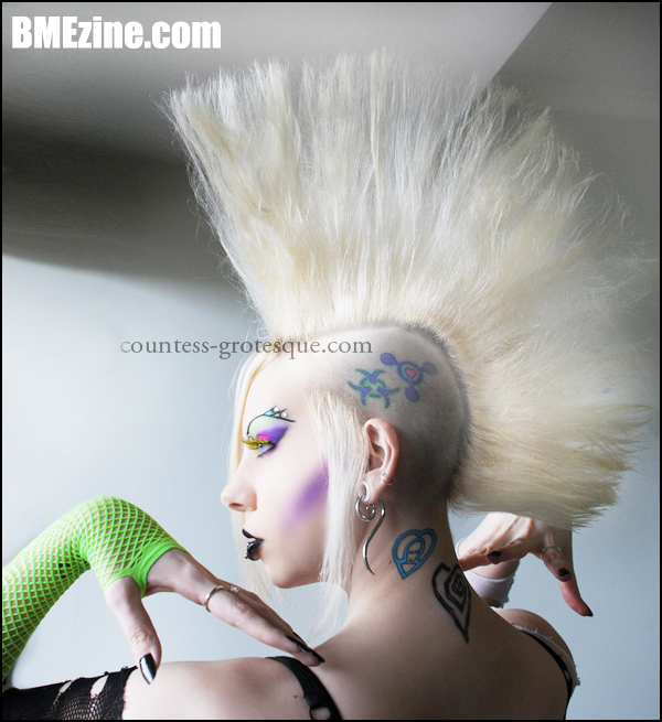
Whoa hey, it’s Countess Grotesque, checking in with one hell of a hearty mohawk, among other lovely adornments! Those adornments being, of course, the various symbols and insignia tattooed on her head and neck, not to mention a (to my eyes) damn-near flawless make-up-and-jewel job. Also? Bright green fishnets. What’s that song again? “My Stockings Are So Bright I Gotta Wear Shades”? Something like that.
Oh, you’d like another picture? We’ve got you covered. Guess where to find it.
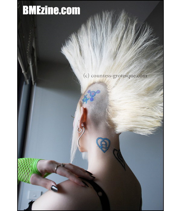
See more in “Facial and Neck Tattoos“ (Tattoos)
Comments
60 responses to “Always a Bloody Owl”
Saara: Nah you can do it with mousse and hair spray provided you’re not severely asthmatic (I run when the hawking gets done).
As for the Countess. One of the prettiest looking women on the Melbourne scene, but there are far more beautiful.
Saara: Nah you can do it with mousse and hair spray provided you’re not severely asthmatic (I run when the hawking gets done).
As for the Countess. One of the prettiest looking women on the Melbourne scene, but there are far more beautiful.
she always looks gorgeous!
hearts*
she always looks gorgeous!
hearts*
There is Allot of photoshoping in these shots. I would like to see what she looks like without all the retouching?
There is Allot of photoshoping in these shots. I would like to see what she looks like without all the retouching?
Actually, countess does NOT photoshop herself – she has no need to. She is beautiful both with AND without makeup. She is a skilled makeup artist, model and photographer – check out her website 🙂
Actually, countess does NOT photoshop herself – she has no need to. She is beautiful both with AND without makeup. She is a skilled makeup artist, model and photographer – check out her website 🙂
i like the heart symbol aesthetically but EMDM was a terrible album, something more worthwhile would have been the shock symbol imo even if not as “pretty” but: substance > appearance
omega symbol isn’t half bad, i don’t like the placement though.
i like the heart symbol aesthetically but EMDM was a terrible album, something more worthwhile would have been the shock symbol imo even if not as “pretty” but: substance > appearance
omega symbol isn’t half bad, i don’t like the placement though.