
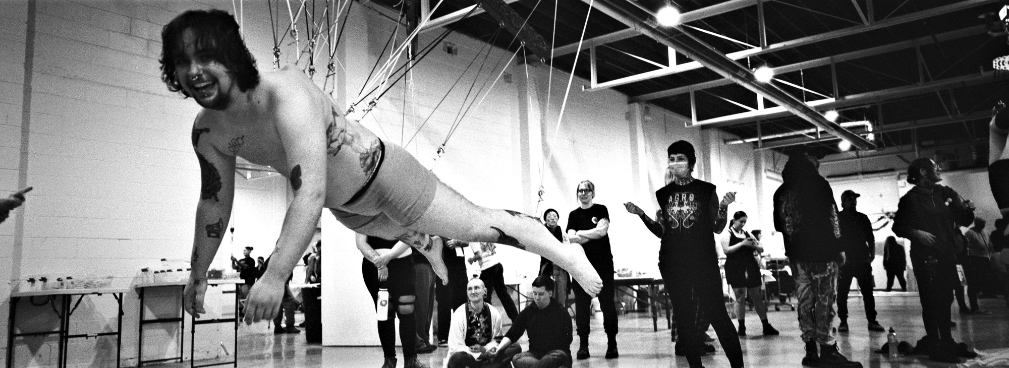
Hey, you heard the legs. Sound advice.
Well, it was a short week on account of the holidays, but I think we squeezed some fun out of it. To send off 2008, we:
And lest you think we forgot, the annual BME Year-End Awards will be up very shortly. (You think you’re excited? Feel these nipples!) Other than that, a couple posts over the weekend, and then we get back into the regular routine, Monday morning. Be safe, folks, and of course, thank you for your continued support of BME. Have a great weekend.
Comments
220 responses to “This Week in BME”
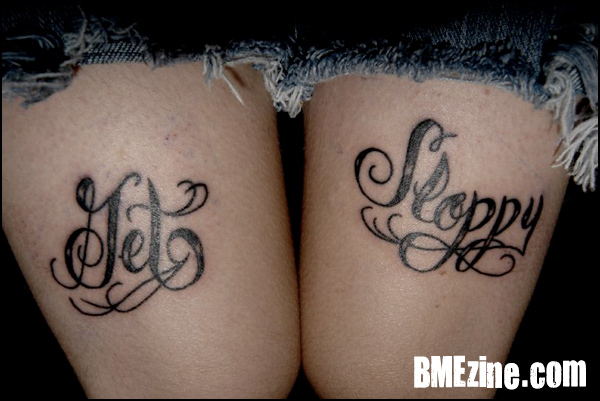
i know the guy that has this tattoo.
it definatly says “get sloppy”.
i know the guy that has this tattoo.
it definatly says “get sloppy”.
i know the guy that has this tattoo.
it definatly says “get sloppy”.
i know the guy that has this tattoo.
it definatly says “get sloppy”.
Gawd I hate to be a moaner, but I miss modblog being updated a ton every day 🙁
Gawd I hate to be a moaner, but I miss modblog being updated a ton every day 🙁
Gawd I hate to be a moaner, but I miss modblog being updated a ton every day 🙁
Gawd I hate to be a moaner, but I miss modblog being updated a ton every day 🙁
yeah, updates, pleeeeeeease?
yeah, updates, pleeeeeeease?
yeah, updates, pleeeeeeease?
yeah, updates, pleeeeeeease?
i was taught cursive in school (in england, i’m 23 years old and back in the day we HAD to be taught cursive), though never to do G’s that way, however, if anyone has seen any of Boog’s script work, you’ll see that the G is perfectly legible.
as a tattooist, when i’m doing script (or any text), i always show the client the piece (and when it’s transferred on too) and if they are unsure, i alter it until they’re happy. as long as the person wearing it loves it, then its perfect.
personally, i would have made the thicker part of the top of the G a bit higher and reduced the length of the ‘stem’ to keep it the right size……and i think that the ‘Sloppy’ is slightly too high (again, could be the photo tho)……………… but thats MY opinion.
the young lady wearing the tattoo (i assume its a lady) is obviously proud of her tattoo, and in my eyes, thats all that matters.
He says he’s a boy…. we need more boys in booty shorts 😉
He says he’s a boy…. we need more boys in booty shorts 😉
He says he’s a boy…. we need more boys in booty shorts 😉
He says he’s a boy…. we need more boys in booty shorts 😉