That is beautiful!
I love the red used for the gears, and it’s so refreshing to see a chestpiece that isn’t heart related
I wonder the significance of the time (It’s gotta mean something..)
Wonderfully done!
Gilmo
Fucking fantastic!
Diva
Very steampunk-esque.
Love it!
Melf
I’m feeling the potential, but also that it doesn’t quite make it. Looks like it’s missing something. Still, as #1 said, it’s nice to see an original chest piece.
punx
really like the ring
tattoo looks good, but why is the six bold?
Oi
I like it, but I agree that it looks like it’s missing something.
This piece is beautiful and a welcome break from the over-used and heart-themed chest-pieces. The colours are fantastic and the style in which it has been tattooed is great, very “rustic”. However, I do wonder if it is connected to the heart at all which I have sometimes heard being referred to as a persons “ticker”. It may be an idiom only I have heard, but it was just a thought.
The only “flaw” I can see is that (in this photo) the eight doesnt look all there, but it might be lighting.
I’d like a little more information on this tattoo personally if only to cure my intrigue and to have some questions answered. For example:
~Why this theme for their chestpiece/What is the significance (if any)?
~Why are the hands pointing at that particular time?
~Why are the cogs red?
As the wearer of three clock tattoos, I always find it interesting that people expect a deep meaning for the particular time on the face of the clock. None of mine are significant times – they either came from a piece of source materials or were chosen for aesthetic reasons by the respective artists. My only rule was that the placement of the clock’s hands needed to be legitimate (i.e. ‘possible’).
This tattoo is lovely. The numbers are a little weird, but that could even be intentional. I especially love the gears!
My hubby would love this! He’s really in gears/clocks and steampunk stuff. 🙂 It’s really pretty.. I love the colors.
FriX
Amazing tattoo !
PoodleKicker
Time to rethink that crap tattoo, lady. Oops, too late.
DaddmanRick
*bump*
Too good not to bring up again…
anybody notice that this piece appears to be a coverup of something else?
–between the gears to your far left (her right)
–under the edge of the watch at the VII
–to the right of the large gear on the same side (her left) can actually see what appears to be the word “god”
I have had a couple of coverups over the years, and this one is excellent! As for the transposition of the roman numerals, perhaps she wanted it that way. Her tattoo, she must like it to let it be shown over the web.
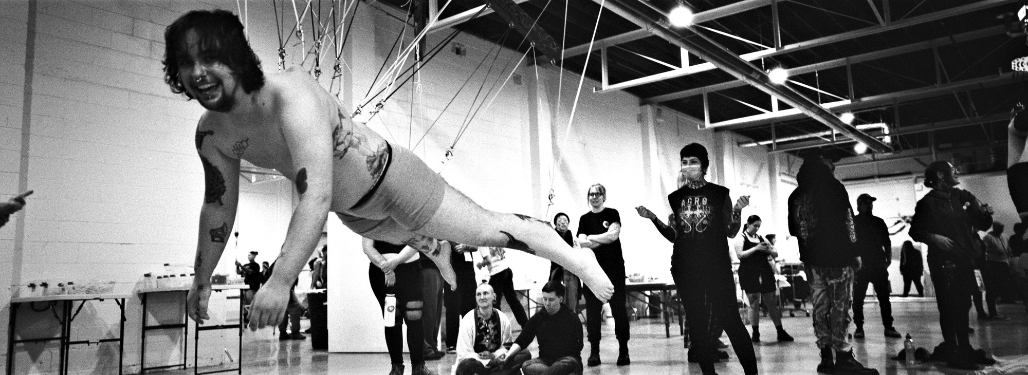
One of the most powerful things about being at a convention like OSC is the sheer concentration of experience, creativity, and capability in one place. When you’re surrounded by people who not only understand the technical complexities of suspension but are excited by the challenge… Read more: Skin and Strings: The Art of Human Puppetry
There’s a particular kind of magic that happens at your first big suspension gathering when you arrive with nerves, an open heart, and the quiet hope of flight. Guided by the encouragement of mentor Lynn Loheide and driven by the quiet confidence of belonging, Alex… Read more: Twelve Points to the Sky
In March 2025, BME attended the Ontario Suspension Convention in Hamilton, hosted by the Kevin Donaghy and the Ontario Suspension Collective. We had the pleasure to take part and help document the event, but also run a booth to sell a bunch of old (but… Read more: Ontario SusCon 2025
Dear BME Community, We’ve been gone far too long, but BME is back to give people a voice, a space, a community. With time everything evolves, and BME may be different than you remember. Our goal is to stay true to Shannon and Rachel’s values… Read more: Welcome Back to Body Modification Ezine
Word of mouth has been our method of reuniting the community, and it has brought a substantial amount of us together. I am inspired by your loyalty and I want to remind more people of BME’s existence. In 2020 we gained control over @bmezine on… Read more: BME Social Media
Despite the hurricanes in 2015 which destroyed almost all of what Rachel owned, she managed to save the original inventory from BME. We have relisted some of the stock on BMEShop.com with the hopes you may be interested. Our first drop includes a selection of… Read more: BMEShop

Comments
29 responses to “Timepiece Chestpiece”
That is beautiful!
I love the red used for the gears, and it’s so refreshing to see a chestpiece that isn’t heart related
I wonder the significance of the time (It’s gotta mean something..)
Wonderfully done!
Fucking fantastic!
Very steampunk-esque.
Love it!
I’m feeling the potential, but also that it doesn’t quite make it. Looks like it’s missing something. Still, as #1 said, it’s nice to see an original chest piece.
really like the ring
tattoo looks good, but why is the six bold?
I like it, but I agree that it looks like it’s missing something.
I’m surprised to see the yellow and red work so well against skin tones. Really fits her, though.
Beautiful!!!
I fucking love it 🙂
time heals everything, and this is so beautiful.
(and big tits are overrated. all you need is a handfull!)
9 and 11 are mixed up.
the 9 and 11 aren’t mixed up, it looks like it at first, but the numbers are written with the bottom being the outer circumference of the clock…
but normally the numbers are written with the bottom on the inside. Especially if you look at 11 and 12, they should be to the same side.
But I forgot to mention that, other than that, I do like this piece. I noticed I sounded mean on my post.
true.. but if you are starting at one, reading clockwise, it works.. even if not traditionally ‘correct’
Flipping gorgeous.
What time is it?
i love it. i assume its part of a larger piece though. would love to hear from her and a follow up if their is one.
I wonder what the significance of the time represented is.
If you read them all as bottom out, 12 is backwards/upside down, like #12/goomy said.
I wish I hadn’t noticed that. I thought this was beautiful… but I’m such a stickler for getting the technical right that I can’t love this.
Que Hora Es?
This piece is beautiful and a welcome break from the over-used and heart-themed chest-pieces. The colours are fantastic and the style in which it has been tattooed is great, very “rustic”. However, I do wonder if it is connected to the heart at all which I have sometimes heard being referred to as a persons “ticker”. It may be an idiom only I have heard, but it was just a thought.
The only “flaw” I can see is that (in this photo) the eight doesnt look all there, but it might be lighting.
I’d like a little more information on this tattoo personally if only to cure my intrigue and to have some questions answered. For example:
~Why this theme for their chestpiece/What is the significance (if any)?
~Why are the hands pointing at that particular time?
~Why are the cogs red?
I love this piece. Great work.
: )
As the wearer of three clock tattoos, I always find it interesting that people expect a deep meaning for the particular time on the face of the clock. None of mine are significant times – they either came from a piece of source materials or were chosen for aesthetic reasons by the respective artists. My only rule was that the placement of the clock’s hands needed to be legitimate (i.e. ‘possible’).
This tattoo is lovely. The numbers are a little weird, but that could even be intentional. I especially love the gears!
#3 stole my words! very nice piece!
absolutely gorgeous!
I LOVE it.
The shading of the gears, the clock’s design…
EVERYTHING!
I love it. Non-heart chestpieces are so awesome.
timepiece chestpiece.. it rhymes!
My hubby would love this! He’s really in gears/clocks and steampunk stuff. 🙂 It’s really pretty.. I love the colors.
Amazing tattoo !
Time to rethink that crap tattoo, lady. Oops, too late.
*bump*
Too good not to bring up again…
anybody notice that this piece appears to be a coverup of something else?
–between the gears to your far left (her right)
–under the edge of the watch at the VII
–to the right of the large gear on the same side (her left) can actually see what appears to be the word “god”
I have had a couple of coverups over the years, and this one is excellent! As for the transposition of the roman numerals, perhaps she wanted it that way. Her tattoo, she must like it to let it be shown over the web.
C YA!